Monday, December 14, 2009

MMO Design - Guild Wars


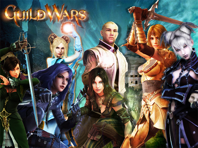
While many may not consider it an MMO it definitely has the design elements of one. Guild Wars is a game with 3 expansions covering the lands of Elona, Canthia, Tyria, and more. Each expansion was designed with a certain theme in mind and is reflected in how everything was made. In Canthia, the Asian theme is prevalent in the structures, the lore and myth, the people, and even the new classes. It's something that is obvious from the get-go, and really draws the player in. Guild Wars is unique in that aspect. Although the world isn't persistent the atmosphere and story create an engaging world. Story is something the developers pride themselves on and is a staple of the game. The world is set up to be instanced in each area outside of main towns so the developers get a chance to make very unique quests. Many quests contain a cut-scene or sometimes interesting dialogue or mission objectives. The main story is the real focus, though. They've designed it in a way that the game almost feels like a single player, but without the help of others players won't get far. Each primary mission contains cut-scenes complete with dialogue and some contain twists and turns in the story. They also provide a background for the characters you interact with or the world you're exploring. Most MMOs don't focus gameplay around story, but their design shows they truly believe it is one of the most important aspects of the overall game design.

They have also designed their game upon the reliance of the skill of the characters, and not by the items they wield. At the beginning of the game characters are the given the chance to make a pvp character, or regular character. The PvP character is given the chance to have weapons just as good as the "best" in the game, with the exception of how it looks. Unlike WoW and the rest, there is no real "epic" loot, but rather rarer items with the same stats and different looks. They further this promotion of skill by only allowing 8 skills to be used at a time, which must be chosen before leaving an outpost or town. Players must create an effective combination of skills, and understand how to use them, or they will have little success. Their design has made it so players that just hit all their skills at once and spam won't get anywhere, and players are actually rewarded for being smart rather than playing for a longer period than someone else. It's a nice break from the norm and gives players a reason to study the skills rather than grind to earn them.

They've also designed their billing strategy brilliantly by making it free. While that might not sound like a great idea it's the reason why they've sold so many copies and sponsors will back them up. They manage to have yearly, or even quarterly, contests between rival guilds for large amounts of money; with one grand prize coming to $100,000 for 8 players. Guilds are also a huge point in their overall design. They designed the game to have a very strong pvp aspect with guild vs. guild battles headlining. In order to make these guild battles be a contest of skill and not numbers, they limit it to 8 per team, with NPCs on each side. Guilds can own their own Guild Hall complete with merchants, storage, and even skill trainers. They designed what basically feels like a home away from home, and a place to strategize. In the latest expansion they've upped the ante on the emphasis of story and making the player feel important. They designed a place called the Hall of Monuments where players can show off all their major achievements. Not only that, they designed these achievements to be integrated into the next game, Guild Wars 2. Your legacy will be continued and the emphasis on story and character development is reinforced once again.

Their overall design focus on making the player feel important is unrivaled. Other MMOs make an attempt to do the same by giving them tons of things to do, and be able to fight these gigantic monsters; while Guild Wars keeps it quite simple. Put the player in an engaging story, reward them for truly strategizing and developing their skill and your game will not only sell millions, but win awards all over the place. This unique design has resulted in a successful series.

Sunday, December 13, 2009

MMO Design - Pirates of the Burning Sea


Next up is another story that involves Sony Online Entertainment(SOE), but this time they're only publishing, not developing. Pirates of the Burning Sea is a game set in the Caribbean in 1720 centering around, you guessed it, pirates and ships. The MMO was developed Flying Lab Software(FLS) and was released in January 2008. At its core design, Pirates of the Burning Sea was meant to be a historically accurate, but fun, game in the Caribbean with a player-driven economy. Over the years its design has changed slightly, but overall sticks with what it promised. FLS came at this theme with a sturdy, but open, mindset. They wanted it to be historically accurate, there was no question about that and nothing was going to change it. There weren't going to be ghost ships or Jack Sparrows cruising around the Caribbean. The ships mimicked real life blue-prints and findings in scale and looks. All ports were based off of historical documents and designed to also look like the faction they belonged to. Speaking of factions, players could choose one of four. They could be Pirate, Spanish, French, or British, with the Dutch being a neutral non-playable nation. The design of each town and the people in it were based upon the nation, and they kept the most authentic feel they could. They kept this authenticity going on the seas as well. Ships travel faster along currents and careful attention must be paid to the wind in order to make the most of your time. Their authentic design hits a peak when it comes to the ship battles, their most toted feature. Ships control like they would in real life, and like real life the wind and positioning are the most important aspects of battle. Different strategies must be employed depending on the ship you're using and what you're fighting. It all feels very realistic; it feels how one would expect. This all sounds about right and how their design should be, but they change it up drastically in certain categories.

Very rarely does a developer truly listen to its user base. I can say that with confidence after witnessing many games destroy themselves because of the developers' arrogance or stubbornness. The devs at FLS frequently interacted and chatted with players on the forums, IRC rooms, and at conventions. That was just the tip of the iceberg, though. They designed POTBS to allow user-designed flags and ships. This was a huge catch for the game and really made the community come together. These designs were not taken without review, and developers, as well as players, would vote on whether or not to include them in the game. Many ships that were submitted to the review committee, ships completely modeled and rigged in 3D, were included in the game. At the game's launch almost half the ships that were attainable were created by players; with many people creating more than one. Flag designs were also included, and the only flags that weren't created by players were the nation flags, story flags, and a bunch of stock flags for those who didn't create one. Players could buy their flags in the game, or trade them, and sail with them on their ship. These developers not only designed a system for a high amount of customization, but one that literally allowed the players to help create the game. Developers also highly insisted on a completely player-driven economy. This meant players were responsible for making most ships, materials, and miscellaneous items. While there would still be unique items and recipes that would drop, players created and kept the economy flowing. Merchants offered basic supplies and ships, while players sold their items on the auction house. While this is a very unique design it requires a large user base as well as an active one. It's another example of their philosophy about listening and interacting with their players.

Like I mentioned before, its rare to see a design like this actually happen despite how logical it is. Sure it isn't the most successful game and doesn't have any huge breakthroughs, except maybe the user content, but it sticks a direction/design and sticks to it; a design centered around the player for the player.

MMO Design - Star Wars Galaxies


Star Wars Galaxies(SWG) is an MMORPG that is located in the Star Wars universe. It was developed by Sony Online Entertainment(SOE) and released in June 2003. SWG promised players and fans alike a world true to the title. Without centering it around this design buyers had no reason to trust the developer except for their past credentials. Upon release SOE lived up to its word and had a successful release. The worlds reflected their descriptions in books and movies. The races spoke in their own languages, which you only understood if you either learned through skills or were the race yourself. The player could also run into characters from the Star Wars canon like Han Solo and Darth Vader. It looked like Star Wars, it sounded like it, and it felt like it. Their world and character design were flawless, which can be tough when expectations are so high. They also designed their profession system realistically. As one would assume, becoming a master Jedi or Bounty Hunter isn't easy. Players would progress through tiers in each basic profession until they reached this higher level. They would also determine this by the weapon they used in battle; gaining skill as they fought with it. What makes their design so unique and grand is the depth. There were literally over 50 professions one could become in SWG. Usually in MMOs players are limited to no more than 10, but their design allowed players to not only learn one of these professions, but 2 to 3 at a time. Their design also allowed the player to drop a profession to learn a new one whenever they wanted. They gave the player the freedom to become what they want, when they wanted. The Jedi also elicited a unique design to learn as well. A player would progress through a series of quests that would span at least 3 months; because of how they designed each major event to happen. While many people may call this broken; it stays true to their design philosophy. They didn't want a Jedi to be easy to get, so they designed it in a fair but difficult way to achieve. Yet again they stayed true to the canon by being realistic within their world. SWG also allowed a level of freedom and customization that most gamers weren't used to. Their design for action outside combat and quests consisted of being able to make a house, city, and even a base for your guild. They allowed the player to place their house, which had many sizes and layouts, almost anywhere on the map they wanted. Cities and bases could be upgraded and even rated by other guilds, another design element to promote community interaction. Inside these places players could create a world of their own, or just flat out store items; the choice was theirs. An example of another great design that allowed the player to really feel like they were in the Star Wars universe.

SOE wasn't perfect, though, and made what made be the biggest mistake in the MMO industry. In 2005 they decided to do a complete 180 on their game design, though not aesthetically. Their first mistake came with the release of the Combat Upgrade(CU) in April 2005. Instead of sticking with the design to keep a high level of depth and complexity of the game, they made it simpler. Combat was pushed down to the level of other MMOs and required much less micromanagement. As a result of this choice, cancellations temporarily rose. The next and worst example of a redesign, some would say in video game history, came with the New Game Enhancement(NGE) in November 2005. Not only was there a breakdown in the design department, HR got ripped to shreds as well. A couple of days before the NGE was released an expansion called "Trials of Obi-Wan" was released, opening up a brand new planet and added content all around. Players had 2 days to enjoy this before the game was completely changed, and with only 24 hours warning. The NGE saw the deep complexity of the profession system completely scrapped and the battle system turned into a button mashing fight. The number of professions dropped to 9 and the player only allowed another sub-profession within that one. A player could choose to be a jedi, bounty hunter, or officer from the beginning, though not masters. Gone were the meaningful Jedi quests and instead came the cookie-cutter story line everyone followed. As expected subscriptions eventually plummeted and SOE heard about it. There has never been such a drastic change in game design since, at least not that the public has seen. All around the board they had designed a great MMO with even greater potential in the future, but certain choices turned that around and sent it to the ground in a smoldering heap. This is the worst example of a redesign in the MMO industry, and hopefully everyone learned from a lesson.

Saturday, December 12, 2009

CS4 Design - December 12, 2009


Maybe it's just me, but I'm not a big fan of the CS4 series from Adobe. The redesign of the interface doesn't bother me in the slightest; I can adapt and learn how to use it. I actually like the fact that they'll let you revert to the Classic setup along with other setups depending on what you plan to do. The only part that really irks me is how unstable each and every program is now. I don't use PS or Illustrator as much as I used to, but it seems to run so much slower and crash far more often on the weakest changes. There's been times where all I'll do is import something, of course forgetting to save beforehand, and it will flat out crash. Flash is especially touchy now. I can't count how many times it's crashed while simply testing a new piece of code, and it's not even one of those infinite loop crashes that I used to get(those were my own fault). I'll be hovering my mouse over the error report to see what it is and windows will start flickering all over the place. Even though you can customize it, dragging windows are far more touchy and seem to lock on to anything and everything. I spend more time trying to find where my actions panel went than actually coding. It's frustrating because I loved CS3, but I need to keep with the class and CS4 files differ from CS3 files. I've never understood why developers will do this. They add some features at the cost of more important things. It could just be every computer I run it on, or maybe I'm just really good at breaking it; who knows. At least it's taught me to save more often.

Piggy/Coin Banks! - December 12, 2009


Here's something people don't think about making a great design out of; piggy banks! Ever since I got my pirate head bank I've used it over all the others, even my bigger, lighter, older piggy bank. Sure I love pirates and that may be a reason, but that's just it. If you can design some type of coin bank that would hit the perfect tune for thousands of people out there you could make a nice chunk of money. There's light up and animated coin banks, and even ones as tall as a small child. There are even digital counting coin banks so you always know how much you have in there. Well, I suppose there are more than I previously thought, but there's gotta be something out there nobody has thought of yet. How about a coin bank that not only stores and counts how much money you have, but also separates them into different sections. When you're ready to roll them up you can even prompt it to do so! Throw in different sound tones for each coin dropped, and it can be used as a music toy! Eh, maybe a little much. What's already out on the market is impressive and it's just waiting for the next hit to come along. The piggy bank market...

Album Cover Design - December 12, 2009


Lately album covers have started to lose their uniqueness and they don't really stand out from one another. Every once in a while you might find one that catches your attention, but nothing like they did with records. Above is the cover of The Beatles' album, "Sgt Peppers Lonely Hearts Club Band", one of their best albums. It has faces from famous people throughout time and all over the world. They are also represented in two different forms themselves symbolizing how different this album will be from their past albums. Like the music, their album cover was out there and in another world. It catches your attention and causes you to take more than a glance by at it. The use of vibrant color sets it off, and the cutout people provide a stark contrast to it. It's one of my favorite album covers.

Pop-Up Books - December 12, 2009


The book is named Voyage to the Heart of Matter: The Atlas Experiment at CERN and it is written by Anton Radevsky and Amy Sanders. It currently costs $33 and is available most places. This is a pop-up style book about the Large Hadron Collider(LHC) that gives a different look into how it works. Each page chronicles a different part of the process in either the development or the actual experiments ran by the LHC. It's nice to see something so intricate explained in something as simple as a pop-up book. We're treated to something that is visually stimulating while still providing an explanation about what's going on. This isn't something you would expect to see on the subject and will surely stand out from others of the same type. This design is brilliant because of those reasons.

Friday, December 11, 2009

The Rotating Outlet - December 12, 2009


Now this is a great idea for hotels and places that will see lots of international business. People would also love to see this in airports, obviously, and maybe even in amusement parks. This is the rotating outlet, just a picture and no other information, and it is meant to aid the people who can't plug their devices in because of their country's standards. Since countries won't be deciding to come up with a worldwide standard, god forbid we work together, this is a nice little workaround. While there are universal adapters and other tools to fix the problem this would be much more convenient. Another issue would be changing the voltage to match the plug. If that could be achieved then this thing could definitely take off. It'd be a great help to everyone.

Scottevest Pack Windbreaker - December 12, 2009


This is the Scottevest Pack Windbreaker and it was designed with the gizmo-geek in mind. There are 17, yes 17, pockets to hold your luggage. It was also designed for a light traveler; if you might be going on a day trip for example. The pictures show the slots holding things like a magazine, an ipod, cellphone, and even binoculars. The jacket also folds into its own back pocket and can serve as a pillow just in case you get caught on a long train ride. The TravelSmart System makes all your electronics pockets easily accessible; as well as the places for your wallet, glasses, etc. Outside it looks very simple and sleek. There is no bulging and the material is made breathable. If I were going to spend $75 on a windbreaker then I would highly consider buying this; IF I were to spend that much.

Shoe Designs - December 12, 2009


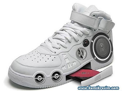
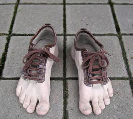
Shoes are designed by everyone everywhere. Basketball players come up with designs, soccer moms come up with ideas, industrial workers; everyone needs a pair of shoes or boots or whatever, and they each serve a purpose. They might be designed for functionality or they might be designed with aesthetics in mind. Many athletes have their shoes designed to help them gain an edge over opponents, but keep a good look in mind. The most notable athletes are basketball players and they tend to come up with some pretty neat designs. There are also some unique designs like the ones above. The first is a cd player shoe concept and it's definitely a unique design. The picture underneath shows some human feet shoes and is really cool. I can imagine the shock value you can get out of those, and it wouldn't be too bad sticking your toes into individual spots. Outlandish shoes like this really get you thinking about how far they can take shoes. Holographic shoes(that seems to be a recurring theme for me) coming up!

Smart Baby Case Concept - December 12, 2009


This is the Smart Baby Case design concept from Pouyan Mokhtarani at Yanko Design. It isn't meant to keep your baby in all the time or even grow the baby, but a place to keep him in places like the airport or mall. The case contains an air purification unit for those places that may have harmful air for the child and a safeguard to automatically shut the case if the air pressure gets low, and will provide the baby with fresh air. Inside there is a communication unit with an LED screen to so your baby can see and hear you. There is a logo on the inside to show you the quality of the air as well as an auto-rocking unit. The case also contains an auto-flushing unit for both types of waste that goes to the front. Overall it looks like a futuristic baby carrier with extra features. Some are a little bit extensive, but others serve a great purpose. Keeping your baby from harmful air is a plus, especially if traveling. It's a design with good intentions in mind; the world just probably isn't ready for it yet.

Lampshade Designs! - December 12, 2009


I must be getting desperate if I'm actually looking at lampshade design, but they can really be pretty awesome. Most people are probably used to the umbrella shaped lamp design with some nice colors and shapes on them or whatever, but there's a whole world of them out there. For example, the one on the top is a lily shaped lampshade that doesn't just shoot the light out of the top and bottom, but rather muffles it to drown it out. With different colored materials this can look really nice and can bring a room together. The way it's designed gives it depth so you can see each pedal. The second picture is the Materialise.MGX, and is a collapsible lampshade. It unfolds and is placed right over the top of the light, giving it almost the same feel as the lily. The neat part is the folding feature, making it much easier to move than those pain in the butt normal ones. It's little features like that that make a good design great.

Uno Bike - December 11, 2009


The bike you see above this is an example of a crazy concept made reality. This is the Uno Bike and it was created by Ben Gulak. His original concept was one that had the idea of a Segway in which you would lean forward to accelerate. He quickly learned that this was too scary once you got to a certain speed and had to revamp the design. What he decided to do was way cooler. He made it so that once the user hits 20mph one of the wheels will slide forward and in front of the other, turning it into a regular motorbike. This way it can handle the speeds that it's expected to go; up to 40mph. As cool as this is it feels like he could have done something better and more useful. He obviously has an extraordinary eye and brain for inventing and designing, but it's wasted here. Regular cyclists can go faster than this thing can and don't require fuel. It will be interesting to see where he goes next and will definitely be a name to remember.

IGN Site Redesign - December 11, 2009

IGN

IGN recently did a complete redesign of their website in order to get rid of some of the clutter, add some new features, and overall just make it look better. At first glance it really does look better, though there's some adjustments to be made if you're used to the old website. The color scheme is pleasing to look at and isn't overpowering. Their most proud feature is the revamped navigation, and I have to say they did a damn fine job cleaning that up. It's much more streamlined and easier to find what you're looking for. Hovering over each tab will pop up a menu with areas for each system. It creates an amount of depth to the website that isn't visible until you try it. They also added a player on the front page that actually plays the videos now instead of linking you to another page. This is a really nice and helpful feature and thankfully it works perfectly, one of the best I've seen on a website. Underneath that are the top stories accompanied by the Daily Fix, their daily video update. This serves its purpose but your eyes can pass over it easy. After that it looks like they sort of threw the rest in. There is a bunch of junk that is really unnecessary for a front page, and clutters it up more than anything. They could stand to clean this up, or trash most of it, and it would pull the site together. This would also eliminate the overboard amount of scrolling it requires. I've always heard in design classes that your user shouldn't have to scroll down to find what they're looking for, which is possible on this website, unless you want the top stories. Overall it's a wonderful redesign and the fact that they didn't overdo the flash makes me happy. Awesome job!

Shadow of the Colossus Level/Enemy Design - December 11, 2009


I'm not going to blog so much about the game itself as I am about how the levels, and basically the game, is designed. For background, you, Wander, live in a kingdom that has been abandoned and your love lies unconscious on a stone. Your best friend and steed, Argo, must ride off to kill the titans and free her from this spell. Your journey between her and each titan consists of no fighting, only riding to the destination. There are 16 in enemies in the game, all Colossi. The are all larger than you, some as massive as buildings, and intimidating as hell. Each colossus looks like an animal, real or fake, except for a couple which resemble buildings more than anything. The amazing part about it is the fact that these bosses become levels in themselves, as they are always moving and you must climb onto them and navigate your way to their weak spot. It was an amazingly new concept, and the design of enemies meant the design of a level. Not only was it one of the most fun games I've played, but it was one of the most beautiful. You would figure that if a designer had to go through that much trouble to integrate the 2 then it might be hard to find time to make it look good as well, but oh my how they pulled it off. It started to push design from other developers to attain the same type of epic feel that this brought with it, but nothing has reached the level of this.

Surfing and Etc. - December 11, 2009


I've always been interested in surfing and watched a couple of documentary/movies in the past few years. One thing I've always wondered about was the designs ON the surfboard and what they mean. There's the obvious designs that are centered around the companies' name and logo, with some spiffy looking designs going up and down the sides. Those are cool and all but for the most part it doesn't really tell you anything about the surfer themselves. I know in many countries surfboards pertain to their ancestry and history of the area. The Hawaiians, for example, use many of the old petroglyphs and language on their boards. Many of them will be as beautiful as a mural, and communicate a deep respect for whatever is illustrated. Most surfers have a respect for the ocean past what most of us can even fathom and treat it as a god in itself. It's truly an amazing thing to listen to one of those people talk about surfing and the ocean; it's like their happiness runs deeper than anything we can imagine. I suppose I got a little off-topic there; it's just a feeling I hope to achieve someday. If I could tie this into design I would relate to the way we design our lives to be. If I design my life in a way so that everything I do will help someone then I'd say that's not a bad design, right?

Left 4 Dead 2 Special Infected - December 11, 2009


The special infected in Left 4 Dead are the zombies who managed to get superpowers and thus are the most dangerous. They look scary, sound scary, and their abilities are intimidating. They each serve their own purpose and when they work together they can destroy your team of 4 survivors in a matter of seconds. Valve took the special infected a step further with the release of Left 4 Dead 2. There were issues with people camping in corners during attacks from the horde, so they added an infected called the Spitter(above) which shoots an acidic green goo on the ground that harms any survivor standing on it. The model also matches the name the special infected. The jockey is a really short quick zombie that jumps on the backs of survivors and rides them around to separate them from the group. They not only designed the special infected with their purpose in mind, they actually matched their abilities and models to them. It makes sense, of course, but it's not always the easiest thing to do. Yet another example of Steam taking a concept and perfecting it.

Welcome Mats - December 11, 2009


Welcome mats are a greeting to let the visitor know that they are welcome in your house. It should make them feel like they are wanted and are a guest that will be served. Or not. The top welcome mat is from a website called curiosite, and looks to be more of a gag gift than anything. It's a welcome mat that weighs the person that steps on. Cruel; yes, but pretty clever. Probably won't make your visitor feel all that great before stepping in the house. Other mats try to insult your guests with words and not devices. Like many other welcome mats the second one was made for laughs and succeeds. They do both do their primary job, though, and that is to allow the visitor to have something to wipe their feet on. Much like the pavement blog I posted, I feel that floor mats have been taken to the next level. There are mats that light up and mats that play sound, especially during Halloween. It would be neat to see a programmable floor mat that initially started blank, but then you could put your own image and sounds in it. It sounds like more of a home project idea, but it could make a nice gift for the nerd in everyone.

Google Chrome Features Ad - December 11, 2009


I am in love with this ad. It's a new ad for Google Chrome representing its features in a series of short videos. In each section of the video it sort of gives you a background of how each one was made, and it's just really neat. The music and graphics give everything a childish feel, but one that makes you feel comfortable and can be taken seriously. Each section fully represents the word that its supposed to describe with my favorite being stability. It took me a few moments to get it but when I did it made me laugh. It showed 3 windows up with dominoes above each one, and the first one playing pong. The pong game has a layer of ice cover it, signifying it froze up, and the dominoes above it fall while the other two windows keep going like nothing happened. The ad is very reminiscent of Apple ads in the music and simplicity in them and are pleasing to both senses. The difference in its approach compared to other developers helps make it stand out and look unique. It also comes across as sincere and not arrogant in any way; like all they want is for us to benefit. I've gained respect for Google over the past year or so and what they're trying to do for not only the internet, but the industry as a whole and this video makes me like them even more.

Electrolux Silent Vacuum - December 11, 2009


Here is a concept from a company called Electrolux for a silent vacuum. Not only is the vacuum silent, there is a spot to dock your ipod and have the vacuum play music through it. The vacuum is one of the older style types with the body connected to a hose and you sweep with the long handle-like thing. They currently have a regular silent cleaner as well as a robotic vacuum cleaner, both for sale. I particularly like the design of this one, though, mostly because of the center around the ipod. It looks very slick and those green LEDs give it a nice futuristic kick. I also like how everything is balanced and symmetrical. The design for the buttons and usage also look very simple. I'm thinking next up is a vacuum cleaner with a video screen on it or, better yet, one that projects an image in front of you to watch.